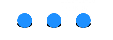
效果展示

分析组件结构
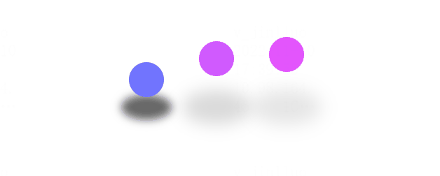
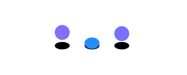
从整体来看 整个loading组件包含上面的三个小球和下面的三个阴影
所以我们可以得到下面这样的html结构
1
2
3
4
5
6
7
8
9
10
11
12
13
14
| <div class="wrap">
<div>
<div class="ball">
<div style="--b: 1"></div>
<div style="--b: 2"></div>
<div style="--b: 3"></div>
</div>
<div class="shadow">
<div style="--b: 1"></div>
<div style="--b: 2"></div>
<div style="--b: 3"></div>
</div>
</div>
</div>
|
给小球和阴影添加一些样式
1
2
3
4
5
6
7
8
9
10
11
12
13
14
15
16
17
18
19
20
21
22
23
24
25
26
27
28
29
30
31
32
33
34
35
36
37
38
39
40
41
42
43
44
45
| <style>
* {
margin: 0;
padding: 0;
box-sizing: border-box;
}
body {
height: 100vh;
}
.demo {
display: flex;
justify-content: center;
align-items: center;
height: 100%;
}
.ball {
position: relative;
}
.ball div {
position: absolute;
left: calc(40px * var(--b));
width: 40px;
height: 40px;
border-radius: 50%;
background-color: #1e90ff;
bottom: 0;
}
.shadow {
position: relative;
}
.shadow div {
position: absolute;
left: calc(40px * var(--b));
width: 40px;
height: 20px;
border-radius: 50%;
background-color: black;
bottom: 0;
z-index: -1;
}
</style>
|
现在我们得到了这样一个组件
给小球添加一下动画
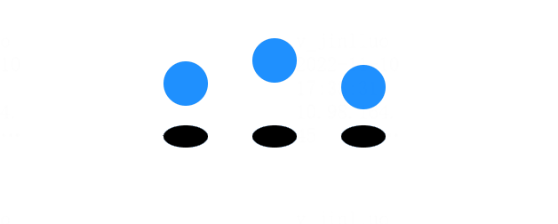
先做一下动画拆解。很明显三个小球的动画是一样的,都是往上弹跳,然后落下,落下触底时会有一个压缩形变,但是三个小球的动画起始时间是不一样的,这里又需要用到我们的css变量了
先定义一个小球上升,下降的动画
1
2
3
4
5
6
7
8
9
10
11
12
13
14
15
| <style>
@keyframes jump {
0%,
100% {
bottom: 0;
}
50% {
bottom: 60px;
}
}
.shadow div {
animation: jump 1.5s linear infinite calc(0.3s * var(--b));
}
</style>
|
现在你将得到下面这样一个动画
它没有在碰撞底端时压缩,也没有颜色变化,现在我们为他加上这些
1
2
3
4
5
6
7
8
9
10
11
12
13
14
15
16
17
18
| <style>
@keyframes jump {
0%,
100% {
bottom: 0;
height: 30px;
}
10%,
90% {
height: 40px;
}
50% {
bottom: 60px;
filter: hue-rotate(90deg);
}
}
</style>
|
现在我们的小球就做好了
小球阴影样式
小球阴影我们可以看到是在小球升高的过程中体积变大,并且颜色变淡,这就很好写了
1
2
3
4
5
6
7
8
9
10
11
12
13
14
15
16
17
18
19
| <style>
@keyframes shadow {
0%,
100% {
transform: scale(1);
opacity: 1;
filter: blur(2px);
}
40%,
60% {
transform: scale(2);
opacity: 0.1;
filter: blur(5px);
}
}
</style>
|